An Idea Mapping Success Blogs Weblog
Idea Map #11 – Considered Colour by Steve
19Apr2007 Filed under: Helpful Hints, Idea Mapping Example, Memory, Mind Mapping Examples Author: Jamie Nast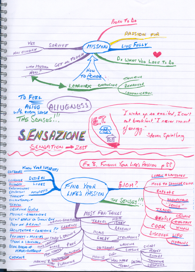
If you have been following the conversation between myself and Steve Rothwell (Reading, UK) on the April 13th posting, you will be excited to see Steve’s maps today. Idea Maps #10 (posting below) and #11 prove that your maps don’t need to follow any rules or be beautiful to be effective. I’ll let Steve describe this map in his own words:
“I was reading a book and wanted to capture some key ideas. I drew these in the top half of the page. I then realised there were links with ideas from other sources and quickly made simple notes in the middle of the page. Note how I used colour and images to make the notes vivid. I then went on to create the map at the bottom to makes lists in response to some questions.
The purpose of this map was to remember some key concepts and how my interests and experiences relate to them. Although a number of rules are broken here also, it’s fairly neat and I have taken time to use colour and images. I wanted to make the map memorable.
Interestingly this map inspired the ideas captured by Fast and Furious map. Its colourful image was so vivid in my mind that I was able to make mental cross checks to it as I scribbled away on the new map.
I must also stress that I have since learned to turn my notebook on its side to give myself a bigger, better space for mapping.”
![[Ask]](http://ideamapping.ideamappingsuccess.com/IdeaMappingBlogs/wp-content/plugins/bookmarkify/ask.png)
![[del.icio.us]](http://ideamapping.ideamappingsuccess.com/IdeaMappingBlogs/wp-content/plugins/bookmarkify/delicious.png)
![[Digg]](http://ideamapping.ideamappingsuccess.com/IdeaMappingBlogs/wp-content/plugins/bookmarkify/digg.png)
![[Facebook]](http://ideamapping.ideamappingsuccess.com/IdeaMappingBlogs/wp-content/plugins/bookmarkify/facebook.png)
![[Google]](http://ideamapping.ideamappingsuccess.com/IdeaMappingBlogs/wp-content/plugins/bookmarkify/google.png)
![[MySpace]](http://ideamapping.ideamappingsuccess.com/IdeaMappingBlogs/wp-content/plugins/bookmarkify/myspace.png)
![[Slashdot]](http://ideamapping.ideamappingsuccess.com/IdeaMappingBlogs/wp-content/plugins/bookmarkify/slashdot.png)
![[Sphinn]](http://ideamapping.ideamappingsuccess.com/IdeaMappingBlogs/wp-content/plugins/bookmarkify/sphinn.png)
![[StumbleUpon]](http://ideamapping.ideamappingsuccess.com/IdeaMappingBlogs/wp-content/plugins/bookmarkify/stumbleupon.png)
![[Technorati]](http://ideamapping.ideamappingsuccess.com/IdeaMappingBlogs/wp-content/plugins/bookmarkify/technorati.png)
![[ThisNext]](http://ideamapping.ideamappingsuccess.com/IdeaMappingBlogs/wp-content/plugins/bookmarkify/thisnext.png)
![[Twitter]](http://ideamapping.ideamappingsuccess.com/IdeaMappingBlogs/wp-content/plugins/bookmarkify/twitter.png)
![[Webride]](http://ideamapping.ideamappingsuccess.com/IdeaMappingBlogs/wp-content/plugins/bookmarkify/webride.png)
![[Email]](http://ideamapping.ideamappingsuccess.com/IdeaMappingBlogs/wp-content/plugins/bookmarkify/email.png)
Idea Mapping Blog
The purpose of this blog is to share idea mapping examples and related learning from my Idea Mapping, Memory, Speed Reading, and Certification Workshops. This blog is dedicated to my Certified Idea Mapping Instructors, my clients, Mind Mapping and Idea Mapping practitioners around the globe.
Jamie Recommends:
Leave a reply